Picmonkey Tutorial - How to Create Beautiful Banners

2 or 3 years ago, I stumbled upon PicMonkey - an easy-to-use graphic design / photo-editing tool. I was in the middle of babysitting my godbrother and while he was taking a nap, I tuned into a live webinar that Carrie, founder of the Female Entrepreneur Association, was hosting with Melanie Duncan. The webinar was about how + why to use Pinterest and when Melanie got to the part of how she actually creates the images for her Pinterest board, she introduced a tool that makes it super easy for her to do so - PICMONKEY!
I think that was the day when I actually wrote down, "I want to get paid to design pretty images for people on social media." Finding out about Picmonkey opened the door to that dream and now I have a nice, little freelance career on the side doing just that. :)
Now, in addition to using Picmonkey for myself and my clients, little by little I'm starting to teach people how to use it to create BEAUTIFUL images as well. I don't think many people know just how easy it is to create professional, original looking images using Picmonkey.
So, once a week, I'll be sharing a tip on how I use this tool and hopefully it helps you make your own beautiful images too. :)
Here is my creative process in creating this beautiful banner...

1
I opened up a custom canvas on Picmonkey and resized it to the size I need - 966 x 300
2
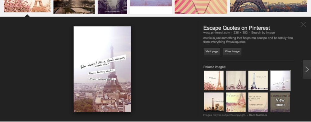
I got inspiration for the design by typing in "Paris, France" on Google (Pinterest works great too) and finding an image that caught my eye. It had a scrapbook look and feel that caught my eye. (see the screenshot of the image I found on google below)

3
I went to dollarphotoclub.com and found a picture of Paris that I liked, downloaded it and opened it up on Picmonkey and laid it over my canvas.
4
Then I opened a printable that I created using Picmonkey and Google docs a couple weeks ago and placed it in the corner with a bit of canvas textured background behind the printable. (I got the canvas backround from www.creativemarket.com - it ties in with elements from my brand/blog)

5
Then piece by piece, I put together the text "Planning a trip to the city of love" using white rectangles and the font "American Typewriter". This part took a little bit of time because I wanted an off-kilter, scrapbook-y look and that meant using multiple boxes of text and tilting each one slightly.

6
Lastly I threw in some little hearts.
Hope this helps spark some more creative ideas for you.

